Quantcast
Channel: Customer.io Blog
Viewing all 214 articles
Browse latest View live

About yesterday's outage

$
0
0

Yesterday we had an unscheduled outage of Customer.io that lasted for 11 hours.

For those 11 hours, we failed you, our customers. I’m sorry for the downtime and the delays in sending out your emails.

The service is back up and fully functional. Your emails are sending again. There’s a post-mortem with technical details.

Beyond the technical description, I wanted to offer you some insight in to our business.

The requirements of an infrastructure business

We made a decision to go in to a business that requires us to be always on. When you implement Customer.io, we become part of your infrastructure.

We never want the service to be down.

Downtime is a poison pill for our business and we spend a lot of time working to avoid it.

John, our CTO had been working for a couple of months on a solution to the underlying issue responsible for the outage. He was a few days away from rolling it out to production for our account. Imagine getting punched in the stomach a few yards from the finish line after running a marathon. The timing was unfortunate.

We can’t promise that we’ll never go down, but we’re making tremendous progress to make sure that doesn’t happen.

If it does, my commitment to you is that we’ll be transparent and open with you about what happened and what we’re doing to fix it.

In the event of an issue, we post on our status page in the event of an issue. If you aren’t yet subscribed, I’d encourage you to subscribe there for updates.

.

How we’re scaling the back end

As we’ve grown the business, keeping up with your data has been a challenge.

We’ve scaled from 0 to 50 million emails a month, 150 million messages processed per day, and many terabytes of analytics data.

We’ve invented queueing infrastructure to make sure other people on the system don’t block your work from getting done.

We’re in the middle of our hiring process for a senior distributed systems engineer who will join John to work on problems like the one that caused the outage. We have been blown away by how a global hiring process can give you access to some extremely talented people. We plan to make this hire within the next 2-4 weeks.

Product improvements are around the corner

We’re making dramatic improvements to the experience using the Customer.io interface with a ground-up rebuild. Candidly, this has taken too long, but we’re nearing completion.

Michael and Henry are working hard to get the new release out. We’re targeting a release that you can use alongside the current product at the end of the month.

At the beginning of the week I switched to the new app to help iron out the kinks.

New App

Looking to the future

John and I have always thought about Customer.io as a business we want to build and grow over 10 years. I think of yesterday’s outage as growing pains - a small blip as we build a stable, long-lasting company to serve you.

Over the next few weeks, we’ll be sharing more with you about our progress reducing the chance of an outage.

In the meantime, if there’s anything else we can do, feel free to email me - colin@customer.io. I’m happy to answer any concerns or questions you have about the outage or your service.


What is customer retention?

$
0
0
Customer retention is a key to success for just about any business, and the best organizations are constantly looking for ways to keep their customers coming back. Robert Scoble

The definition

Customer retention is anything a business does to get people to continue paying them.

A close relative of customer retention is user retention. Websites often focus on user retention. The distinction is that for many websites, their users don’t pay them. Therefore they’re not customers.

Two types

There are two types of businesses that try to retain customers. Subscriptions businesses and transactional businesses.

Subscription businesses (easier)

Any business that requires you to stop your relationship to prevent being charged.

  • Your bank
  • Netflix
  • internet provider
  • Cell phone

Transactional businesses (harder)

A transactional business charges you only when you initiate it.

  • Local coffee shop
  • Retailers (on or offline)
  • Restaurant

As you can imagine, it’s easier for subscription businesses to keep a customer paying.

How not to do it

When I think of traditional attempts at customer retention, I think of this video of a user trying to cancel AOL that made national news. <iframe width="420" height="315" src="http://www.youtube.com/embed/xmpDSBAh6RY" frameborder="0"> </iframe>

Let’s face it. If it comes to this, you’re too late to expect any customer loyaly. Customer retention starts at the time your company first interacts with you and continues for the entire lifetime of the customer.

Try fixing your leaky bathtub

Next time you’re trying to increase profits, consider improving the customer experience rather than boosting sales. You’ll be able to create customers with higher lifetime value (somewhere between 1.7 - 3.4 times the value according to Wikipedia). Imagine a leaking bathtub filled with your customers. You want the bathtub to be full. If you’re leaking customers, it takes more work to keep it full. Why not fix the leak?

Clarifying our privacy policy

$
0
0

A prospective customer had some questions about how we handle your end-user PII (the data about the people who use your app or site). Our privacy policy wasn’t as clear as it could have been.

We want to try and convey:

Your data is your data. You’re just storing it in Customer.io so we can use it to provide you a service.

To provide you with service, we need to share some things that are end-user PII with third parties. For example we need to share someone’s email address with our partner Sendgrid in order send an email to them. But there’s no way in heck we’re ever going to be doing sketchy things like selling your data!

We worked with our lawyer to update the language and make it clearer.

Clearer language about how we use PII

Our Privacy Policy, Terms of Service and Anti-Spam Policy are also mirrored in Github so you will be able to see the history of changes to those docs going forward.

Diff

Here’s the difference between the old and new Privacy Policy.

30 days notice by email before future changes

You may have noticed a banner at the top of your Customer.io account alerting you to the change of the privacy policy. In addition to that banner we’ll also be emailing you 30 days in advance of a change.

Thanks for trusting us with your data. Please let me know if you have any questions about privacy or terms of the service.

Sincerely,
Colin

Using color in your emails - what you need to know

$
0
0

Email marketing color spectrum

Color adds visual intrigue and brings a new dimension to your emails beyond black and white text. It can also help you better direct your readers’ attention to important messages, buttons, or calls to action. After you’ve made your sure your email is optimized for mobile and web, looks great, and has compelling content, consider adding color to your emails to make them even more successful.

What Your Colors Mean

Do you know about Hollywood’s obsession with orange and blue? If not, check out some of these movie posters, but be warned, you’ll start noticing every one using this color scheme. These two colors are a design power couple. They’re on opposite ends of the color spectrum and convey contrasting emotions: we interpret blue as calm or soothing, while orange is energetic, almost “crazy.” The opposing concepts (think also fire and ice, day and night, good and evil) pop against each other, draw in our attention, and promise us a complex story.

Remember our post on first impressions in your emails? Well, up to 90% of those instant judgements are based on color or visual cues. You’ll find plenty of claims out there touting the meaning of colors: red conveys courage, yellow implies optimism, green means balance, or blue suggests trust. While there is some truth to these, people also use their preferences and personal experiences to judge what colors mean for them.

You may not have say in your brand’s color scheme, but it’s still valuable for you to think about what colors mean to your customers. The colors in your emails should create a consistent experience between what people are reading and what they’re are seeing. For example, the colors of Helpscout’s educational emails reinforce their message.

Email marketing Helpscout design example

The grey-blue color accents are soothing (more on that later) while black text on grey and white make it easy for you to scan the email quickly. The calm, muted colors convey steadiness and authority, which for an email promising you information, is exactly what you want. Would you trust Helpscout as an expert on customer interaction if their emails were visually distracting or unpleasant? Probably not.

The right color can convey the value of your emails instantly to your customers. While you may not have a say in your brand’s logo or color palette, try to play around with different graphics, button colors, and text colors to maintain consistency between your email’s message and its intended value. One color won’t necessarily convey the same meaning to everyone. But maintaining consistency between your colors and your email’s intended message can make your readers’ experience more seamless, fun, and interesting.

We just said that you can’t generalize color experiences. But several studies have shown that seeing blue results in positive emotional experiences. A study by Joe Hallock found that the majority of men (57%) and women (35%) picked blue as their favorite color. Hallock’s follow-up study found that across all ages, from children to people over 70, blue was still the top pick.

In a related study, Faber Birren (1961) tested how different colors of light affected the growth of rats. He found that blue light reduces hormonal swings and relaxes the autonomic nervous system, which is responsible for maintaining heart rate, tension, and respiration.

These studies suggest that blue may actually have relaxing and mood-boosting properties. And evidence proves that blue appeals to a wide range of people. If your email contains something positive or calming, like an interesting article or educational information, you might want to incorporate blue into your design if you can, perhaps as a button or graphic.

Use Bright Colors To Make Important, Actionable Items Stand Out

A study by Hubspot tested the effectiveness of green buttons versus red for driving clicks. After letting their A/B test run for several days, they found that the red button outperformed the green by 21%.

The key component here is contrast, not necessarily color. Known as the Isolation Effect, it states that people are more likely to take notice of words or images that contrast with their background, making them stand out. A study examining this effect found that when asked to recall words, participants recalled those that had been visually isolated. The isolated words stood out in their minds, making them easier to remember later.

Use contrasting colors to highlight buttons or calls to action. It will draw your readers’ attention to important items in your email, and probably encourage some extra clicks.

Keep Your Design Clean And Simple

No matter what colors you pick, what buttons you use, or how you design your email, keep things clean and simple. High contrast text on backgrounds are always easiest to read; black and white is classic for a reason. Build a consistent, optimized design for the body of your email, and then add the splashes of color.

You already know how to write and send great emails with compelling, interesting content. That’s what matters, and that’s what your subscribers will appreciate the most. But with a bit of color, you can give your emails a boost to take them to the next level.

Happy Emailing!

Churn Rate Reduction with Retention Emails

$
0
0

Most efforts at user retention are post-cancellation. What if you could know someone was going to cancel before they did?

For subscription services, it’s pretty easy to identify who is about to cancel. Look at their usage data.

Let’s look at a simple example:

A user signed up 2 months ago and is paying for your site monthly. They are going to cancel at the end of the month.

How do you know?

Here is their usage pattern:

Churn Usage patterns

As you can see, they’ve used the site 4 times in the past 6 weeks. What’s most important is that they’re engagement is dropping. They have used the site 0 times in the past 6 weeks. If that’s far off your normal user engagement (and it should be), you want to be proactive.

What can you do to stop churn?

If the user doesn’t cancel before they receive their next bill, they probably will after they do. Here’s a great opportunity to identify this user and engage them with a re-marketing email establishing the value of your product.

Firstly, you want to be able to see these at-risk customers in aggregate. Once you’ve grouped all of your at-risk customers, you can start measuring if your customer retention efforts work.

Once you segment users then create triggered emails to communicate why they should keep paying you. At the very least, it’s an opportunity to start a dialogue about how you can improve your product. Users who feel a connection to you are less likely to cancel. Try different techniques to see what works. And as with all your marketing efforts, measure conversions to see how successful you are at re-engaging customers.

If you measure your efforts, you’ll know what works and what doesn’t. Churn is an issue for every company, and with the right tools in place you’ll beat it.

How to pretend you're always working with email

$
0
0

I like to write and respond to emails at 1:00 am.

However, you don’t want to receive an email from me at 1:00 am. If you do receive an email from me, there’s a higher chance you’ll miss it. But for me, writing an email at 1:00 am makes great use of my time. I batch all of my email writing together to leave the day to focus on making.

One of the things I’ve realized is that the time someone receives an email affects whether or not they respond. So, how do you resolve the difference between personal efficiency and timing?

My solution: Separate the writing of the email and the sending of the email. I’ve been using Boomerang for Gmail to schedule sending my email. When I write an email, I hit “Send Later” and I usually click “Tomorrow Morning”.

Boomerang Send Later

Now, I can write my emails at 1:00 am and recipients receive them the next morning when they arrive at the office. I use this primarily for meeting or phone call follow ups. I try to write the follow up when it’s fresh in my mind, but send it when enough time has passed that our conversation isn’t fresh in their mind.

Some clever ways to use email scheduling:

  • Send a follow up email to a customer.
  • Send an email to your boss at 3 am to make it seem like you’re working late.
  • Delay time-sensitive information to be sent to multiple people at the same time

Our on-boarding is terrible, and why yours should be too

$
0
0

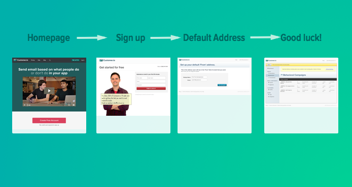
We’ve had the same experience when you sign up for customer.io for about a year. Frankly, it sucks.

Customer.io Onboarding steps

See that last step? We dump you in to the application with a few example campaigns and a link to “Send us data”. Good luck with that!

Why is our really bad on-boarding interesting?

It’s interesting because our customers have been able to succeed (and so has our company) in spite of it. I want to show you how.

Before you optimize your on-boarding experience, consider doing a few things first. Here’s how we went about it:

Step 1: Make your product do something valuable to someone.

Easier said than done, but I’d start here.

A really common mistake I’ve seen (and made) is for products with no users or customers to build elaborate on-boarding wizards.

You could think of this exercise as building a road to nowhere.

The first goal of a new product (or feature) is to deliver value. A great test for a new product is:

Is the reward compelling enough that someone will figure out how to make our product work?

Maybe they can’t figure it out on their own, but if people want what you’re offering, and you give them a way to reach out, you can help people struggle through your immature product to reach success.

That’s what leads you to Step 2.

Step 2: Do things that don’t scale

A few examples of things we’ve done in the past:

  • Talk with every new signup to learn about them, their business and the problems they are hoping to solve.
  • Hand-write the code for each triggered email a customer wanted to send.
  • Have an always on chat-room using Campfire where people could come by and ask questions.

At some point, if you have a small team (we were 2 or 3 people at this stage), you’ll be overwhelmed. That’s when you can start scaling or killing these activities.

Step 3: Scale (or kill) the things that don’t scale

This was a critical decision for our company. Did we want to scale high-touch activities by hiring for sales and account management roles? We decided no and took a different path.

From chatting with customers, we learned what common questions about our product are. This gave us the knowledge to build out comprehensive documentation. Now many people get their own answers to questions. Any time we see recurring questions over email, we try to add answers to the docs.

We also learned what people evaluating our product needed to see. Rather than continuing high touch conversations, we added videos attempting to answer the common questions people were asking. We also discovered an important fact: prospects who still wanted a phone call even with all the information on our site often aren’t good customers for us.

We doubled down on the things that worked for us:

  • great email support
  • comprehensive docs
  • informative videos

And got rid of the things that didn’t work.

Now when people are stuck in the product, there’s a big help link and they have ways to get answers and can see a lot of content to give them the confidence to move forward.

Step 4: This whole time we were tuning our emails.

You know we haven’t changed our product on-boarding, so how did scale to over 300 paying customers and over $50,000 a month in revenue?

In large part, it was because we used our own product to send emails to people during their first week or so in Customer.io.

Here’s an idea of what our post-signup emails look like:

When someone signs up:

  • Welcome email (link to docs, how to get in touch)

If someone doesn’t send us any data:

  • 30 minutes later - offer of help email
  • 3 days later - educational selling email
  • 5 days later - education selling email

If someone sends us data:

  • Immediately - congratulations email

If someone sends us data, but doesn’t really do anything else:

  • 15 days later - request for feedback email

Rather than spending a lot of developer effort building out wizards, we shifted the responsibility for on-boarding to email. It’s a lot faster for us to try new things in email. It’s a lot faster to change things when we find a better way of getting people up to speed.

If you want to see the content of our emails, you can always sign up for the Customer.io, but I’ll also give you an overview of a couple of email types that have been really effective.

An offer to help

Giving people an email focused on getting helped has worked wonders. It makes people feel much more comfortable asking questions than just sending a welcome email.

In some forms this email is a little overused. We’ve been [talking about it for a while](](http://customer.io/blog/Follow-up-on-the-surprise-personal-email.html) but it still works well to let people know it’s ok to email us.

Educational selling emails

There’s a pretty simple idea here. Teach people something interesting that benefits them… then relate it to how your product makes it easy.

Most people evaluating your product or company aren’t familiar with your industry or competitors. They’re not experts. Often they don’t know what they should consider as important.

Teach them how to make an informed decision.

We have two emails which focus on how triggered emails should work and talk about how they usually work in other email products.

Here’s the gist of those two emails:

  • Using data from your app with your triggered emails lets you send timely, targeted emails.
  • Everything works better when your email system works with data in real-time (not batch processing once a night).

To summarize, throught these types of emails, the conversations they engender, and our documentation, tons of people are overcoming the crappy “non-boarding” and finding success with our product. And because the process is lightweight, we can scale our services to an ever-growing list of customers without adding a call center!

I’d love to hear about your on-boarding flows and how you’ve optimized them for your productin the comments below.

Beat big businesses by owning your small size

$
0
0

Most companies begin with just a few people - and being a small company is sometimes perceived as a negative. But being small can actually be great for your business. In fact, it can give you a unique advantage over large clumsy competitors who often lose sight of how what they do impacts their customers.

So, don’t be afraid to be small. Here are a few examples of how you can use your size as a strength:

It’s OK to be Rough Around the Edges

Do you have a dedicated editorial and legal team combing over every word you write? (I hope not!). Sure, your writing might be a little rougher around the edges, but it’s also more candid, interesting, and easier to relate to.

You want to read blog posts with personality that directly relate to your experiences. At Woopra, Natalie Issa wrote about her difficulty finding a marketing automation tool. She’s not afraid to admit that she struggled to find the right product, and that makes her relatable. She speaks from personal experience and has actually researched the options she reviews.

It’s alright if you’re a little casual in places other than your blog. When people sign up for your newsletter (you have one, right?), send a thoughtful welcome email. If you sign up for Groove’s newsletter, here’s the email you’d receive:

The email you receive from Groove's newsletter

Alex adds some nice touches, like providing email address and encouraging you to contact him. That extra step, combined with Alex’s casual tone, builds trust, respect, and likeability.

Show Off The People Who Make Your Company Great

Most big corporations use impersonal language when they write and that makes it less enjoyable to be their customer. Even if you’re automating your emails, why hide that they’re still written by a real person? Check out this great example from Freckle:

Amy Hoy has a way with words

Amy Hoy wrote this, and even went through the trouble of attaching her real signature for authenticity. It’s a small touch, but one that clearly demonstrates thought and effort has gone into the email and to making you feel welcome.

Litmus makes sure you know who’s tweeting on their account: Love love love litmus' twitter background

Putting faces to names and including CoTags so you know when it’s ^JJ (Justine Jordan) tweeting or ^LS (Lauren Smith) is great. People tweeting at Litmus know they are talking to real people. This is a little touch we liked so much, we added it to our twitter account too.

Take the Time To Understand Your Customers Deeply

No matter your size, taking the time to understand your customers’ needs and wants is key to your success. Smaller companies have the opportunity to get everyone involved in activities that improve customer experience and company credibility.

In the early days, spend A LOT of time talking to people on the phone, or in video chat to really understand your customers. As your product becomes more mature, it’s still important to have a pulse on your customers.

Everyone at Customer.io spends time each week helping Diana answer customer queries. We were inspired by Wufoo and this presentation by Kevin Hale, “Everyone On Support”. Getting engineers to talk to customers lets them know where customers are struggling, and helps them feel connected to solving the problem. Everyone on the team knows what is important to our customers.

If you’re just talking to the people who have questions, that’s probably not enough. Bryan from CodeClimate recommended sending out a survey every 6 months to customers. The questions from Survey.io are pretty great, but the reporting isn’t. We sent ours out using SurveyMonkey.com.

One of the surprising things we found out was that 42% of our customers signed up from a personal referral!

I’m sure if you sent out a survey, you’d discover all sorts of things you didn’t know.

Don’t Hide Mistakes When You Make Them

If you’re not making mistakes, then you’re not doing anything. I’m positive that a doer makes mistakes. John Wooden

Successful companies make mistakes. When you do make a mistake, your first instinct might be to pretend that nothing happened while you scramble to cover up the problem. But if you’ve ever been caught lying, you’ll know that brushing it under the rug is not an effective strategy.

Remember when Buffer got hacked? After CEO Joel found out, he sent a personal email to users explaining and apologizing for the breach. He was heartfelt, apologetic, and honest about what Buffer was doing to fix the problem. This post at 3seven9 goes in to more detail.

Think of mistakes as an opportunity for people to trust you more. If you admit to your mistakes, your customers know you won’t hide important things in the future. Acknowledging mistakes will almost always make your customers like you more.

Have Fun!

Having a small company means you can really be free with showing your personality. Share what you’re making for dinner. Post puns, interesting articles, or cute photos of animals in the office on Twitter and Facebook. These personal touches highlight the special something (or somethings) that only you and your company have. Share them with the people who want to get to know you better!

These are only a few examples of strategies you can use to take advantage of your small size. We’d love to get your feedback on how you own being small, whether you use these tactics or have come up with your own. Let us know in the comments below.


Why the worst day of the week is the best day to send emails

$
0
0

We often get asked what the best days and times are for sending emails. When it comes down to it, it’s going to depend on your audience. But how do you decide where to begin your tests? Plenty of people have done studies and offer their opinions, but sifting through them takes time. We’ve boiled down the results from several studies, giving you a comprehensive guide to the best strategies for when to send your emails.
<!– more –>

What day of the week should I send my emails?

What day of the week do you dread? If you said Tuesday, you’re not alone. While the idea of “blue Monday” has been mostly debunked, surveys have found that we experience the most professional and emotional stress on Tuesdays. Supposedly, the pleasure of the weekend allows us to coast over into Monday, but on Tuesday “the reality [of work] sets in”.

But Tuesday might be the best day for you to send your emails. According to a 2013 census by GetResponse, people send over 17% of all emails on Tuesday, making it the most popular day of the week to send.

Tuesday most popular send email (source: Experian)

Tuesday’s emails have an overall open rate of about 18%, the highest open rate compared to the other weekdays. Interestingly, Saturday has the highest open rate overall, at 18.3%. But we need to take into account Saturday’s low volume of email. This makes Tuesday the winner for most emails opened, compared to any other day of the week.

Send educational email earlier in the week. Send actionable emails later.

If you’re a marketer trying to decide the best day to send your newsletter or a lesson in an email course, Tuesday is a sensible default. Take advantage of the high open rates earlier in the week to send emails that don’t necessarily need to drive clicks. Share an update, send out a blog post, or educate your readers.

But if you need help driving clicks or want your readers to perform an action like signing up for a webinar or taking a survey, sending later in the week could work in your favor. The highest CTR actually occurs over the weekend. Email volumes are lower over the weekend and people finally have time read their email.

Here’s an extreme example of sending when you wouldn’t expect people to read (like a weekend). We sent out our annual report on New Year’s Eve (a Tuesday). The open rate (41.9%) and click rate (21.5%) were within the range of most other emails we’ve sent. It just goes to show that if you have interesting content, it might not matter as much when you send it.

Want people to open? Send in the afternoon.

The time of day you send your emails can be just as influential on open rates as the day you send them. You might have learned to send your emails in the morning. However, this may not be the best strategy for your newsletter or on-boarding emails.

While most people check their emails in the morning, they’re usually trying to start their day on a productive note. This means anything unnecessary will likely be trashed or archived without being read. While your newsletter is valuable, it can easily fall by the wayside in the face of work-related stress in the morning. This could explain why the highest email open rates are actually in the afternoon and evening.

Afternoon email opens (source: Experian)

Want people to reply? Send in the evening.

Experian gathered data from a client-wide survey to determine the best time of day to send emails. They found that while the majority of emails are sent between 8:00 AM and 12:00 PM, the highest engagement rates occur between 8:00 PM and 12:00 AM.

Evening email engagement (source: Experian)

Think about it this way. At work you’re busy with everything you need to finish before leaving. After you get home and make dinner, what time do you finally settle down to check your email before relaxing for the night? That’s when your subscribers are going to be the most willing to read your messages.

Most email opens happen within an hour of arrival, so send when people are reading.

A study by GetResponse has also shown that emails have the best chance of being opened within an hour after they arrive in your inbox. After that, the open rate drops to less than 5% after 4 hours. After 24 hours, that drops to less than 1%. Your best bet is to send emails closest to the time your subscribers are able to read them.

Know your audience to pick the best strategy.

These strategies are a good place to start, but they won’t help you if they don’t serve your audience. Know who you’re writing to. Are your readers busy entrepreneurs who want to check their email over lunch, or small business owners who get home late? Is your content work related? Or is it for leisure time? You should adjust your email timing to better meet your audience’s needs and fit in with their schedules.

The timing of your emails is a critical component of your email lifecycle campaign. But while these strategies might help you get started, every small business is unique. If you take away one thing from this post, let it be this: test to figure out what works best for you. It might take a few months, but you should feel free to play around with the days and times you send your emails to find out what succeeds. Run different campaigns with the same content to see what scheduling works best. Take note of the emails that get the most clicks, then send your subsequent campaigns following the new timeline.

What kind of strategy do you use for timing your emails? Share what works for you (or what you’ve been trying) in the comments below.

Happy Emailing!

About yesterday's outage

$
0
0

Yesterday we had an unscheduled outage of Customer.io that lasted for 11 hours.

For those 11 hours, we failed you, our customers. I’m sorry for the downtime and the delays in sending out your emails.

The service is back up and fully functional. Your emails are sending again. There’s a post-mortem with technical details.

Beyond the technical description, I wanted to offer you some insight in to our business.

The requirements of an infrastructure business

We made a decision to go in to a business that requires us to be always on. When you implement Customer.io, we become part of your infrastructure.

We never want the service to be down.

Downtime is a poison pill for our business and we spend a lot of time working to avoid it.

John, our CTO had been working for a couple of months on a solution to the underlying issue responsible for the outage. He was a few days away from rolling it out to production for our account. Imagine getting punched in the stomach a few yards from the finish line after running a marathon. The timing was unfortunate.

We can’t promise that we’ll never go down, but we’re making tremendous progress to make sure that doesn’t happen.

If it does, my commitment to you is that we’ll be transparent and open with you about what happened and what we’re doing to fix it.

In the event of an issue, we post on our status page in the event of an issue. If you aren’t yet subscribed, I’d encourage you to subscribe there for updates.

.

How we’re scaling the back end

As we’ve grown the business, keeping up with your data has been a challenge.

We’ve scaled from 0 to 50 million emails a month, 150 million messages processed per day, and many terabytes of analytics data.

We’ve invented queueing infrastructure to make sure other people on the system don’t block your work from getting done.

We’re in the middle of our hiring process for a senior distributed systems engineer who will join John to work on problems like the one that caused the outage. We have been blown away by how a global hiring process can give you access to some extremely talented people. We plan to make this hire within the next 2-4 weeks.

Product improvements are around the corner

We’re making dramatic improvements to the experience using the Customer.io interface with a ground-up rebuild. Candidly, this has taken too long, but we’re nearing completion.

Michael and Henry are working hard to get the new release out. We’re targeting a release that you can use alongside the current product at the end of the month.

At the beginning of the week I switched to the new app to help iron out the kinks.

New App

Looking to the future

John and I have always thought about Customer.io as a business we want to build and grow over 10 years. I think of yesterday’s outage as growing pains - a small blip as we build a stable, long-lasting company to serve you.

Over the next few weeks, we’ll be sharing more with you about our progress reducing the chance of an outage.

In the meantime, if there’s anything else we can do, feel free to email me - colin@customer.io. I’m happy to answer any concerns or questions you have about the outage or your service.

Clarifying our privacy policy

$
0
0

A prospective customer had some questions about how we handle your end-user PII (the data about the people who use your app or site). Our privacy policy wasn’t as clear as it could have been.

We want to try and convey:

Your data is your data. You’re just storing it in Customer.io so we can use it to provide you a service.

To provide you with service, we need to share some things that are end-user PII with third parties. For example we need to share someone’s email address with our partner Sendgrid in order send an email to them. But there’s no way in heck we’re ever going to be doing sketchy things like selling your data!

We worked with our lawyer to update the language and make it clearer.

Clearer language about how we use PII

Our Privacy Policy, Terms of Service and Anti-Spam Policy are also mirrored in Github so you will be able to see the history of changes to those docs going forward.

Diff

Here’s the difference between the old and new Privacy Policy.

30 days notice by email before future changes

You may have noticed a banner at the top of your Customer.io account alerting you to the change of the privacy policy. In addition to that banner we’ll also be emailing you 30 days in advance of a change.

Thanks for trusting us with your data. Please let me know if you have any questions about privacy or terms of the service.

Sincerely,
Colin

Using color in your emails - what you need to know

$
0
0

Email marketing color spectrum

Color adds visual intrigue and brings a new dimension to your emails beyond black and white text. It can also help you better direct your readers’ attention to important messages, buttons, or calls to action. After you’ve made your sure your email is optimized for mobile and web, looks great, and has compelling content, consider adding color to your emails to make them even more successful.

What Your Colors Mean

Do you know about Hollywood’s obsession with orange and blue? If not, check out some of these movie posters, but be warned, you’ll start noticing every one using this color scheme. These two colors are a design power couple. They’re on opposite ends of the color spectrum and convey contrasting emotions: we interpret blue as calm or soothing, while orange is energetic, almost “crazy.” The opposing concepts (think also fire and ice, day and night, good and evil) pop against each other, draw in our attention, and promise us a complex story.

Remember our post on first impressions in your emails? Well, up to 90% of those instant judgements are based on color or visual cues. You’ll find plenty of claims out there touting the meaning of colors: red conveys courage, yellow implies optimism, green means balance, or blue suggests trust. While there is some truth to these, people also use their preferences and personal experiences to judge what colors mean for them.

You may not have say in your brand’s color scheme, but it’s still valuable for you to think about what colors mean to your customers. The colors in your emails should create a consistent experience between what people are reading and what they’re are seeing. For example, the colors of Helpscout’s educational emails reinforce their message.

Email marketing Helpscout design example

The grey-blue color accents are soothing (more on that later) while black text on grey and white make it easy for you to scan the email quickly. The calm, muted colors convey steadiness and authority, which for an email promising you information, is exactly what you want. Would you trust Helpscout as an expert on customer interaction if their emails were visually distracting or unpleasant? Probably not.

The right color can convey the value of your emails instantly to your customers. While you may not have a say in your brand’s logo or color palette, try to play around with different graphics, button colors, and text colors to maintain consistency between your email’s message and its intended value. One color won’t necessarily convey the same meaning to everyone. But maintaining consistency between your colors and your email’s intended message can make your readers’ experience more seamless, fun, and interesting.

Why Blue Is So Popular

We just said that you can’t generalize color experiences. But several studies have shown that seeing blue results in positive emotional experiences. A study by Joe Hallock found that the majority of men (57%) and women (35%) picked blue as their favorite color. Hallock’s follow-up study found that across all ages, from children to people over 70, blue was still the top pick.

In a related study, Faber Birren (1961) tested how different colors of light affected the growth of rats. He found that blue light reduces hormonal swings and relaxes the autonomic nervous system, which is responsible for maintaining heart rate, tension, and respiration.

These studies suggest that blue may actually have relaxing and mood-boosting properties. And evidence proves that blue appeals to a wide range of people. If your email contains something positive or calming, like an interesting article or educational information, you might want to incorporate blue into your design if you can, perhaps as a button or graphic.

Use Bright Colors To Make Important, Actionable Items Stand Out

A study by Hubspot tested the effectiveness of green buttons versus red for driving clicks. After letting their A/B test run for several days, they found that the red button outperformed the green by 21%.

The key component here is contrast, not necessarily color. Known as the Isolation Effect, it states that people are more likely to take notice of words or images that contrast with their background, making them stand out. A study examining this effect found that when asked to recall words, participants recalled those that had been visually isolated. The isolated words stood out in their minds, making them easier to remember later.

Use contrasting colors to highlight buttons or calls to action. It will draw your readers’ attention to important items in your email, and probably encourage some extra clicks.

Keep Your Design Clean And Simple

No matter what colors you pick, what buttons you use, or how you design your email, keep things clean and simple. High contrast text on backgrounds are always easiest to read; black and white is classic for a reason. Build a consistent, optimized design for the body of your email, and then add the splashes of color.

You already know how to write and send great emails with compelling, interesting content. That’s what matters, and that’s what your subscribers will appreciate the most. But with a bit of color, you can give your emails a boost to take them to the next level.

Happy Emailing!

How to write emails people actually want to read

$
0
0

Even if you’re a good writer, writing great emails isn’t easy. It’s difficult to figure out the perfect subject line, or how to make your emails so compelling you can’t help but stop and read them. But as Customer.io’s new marketing manager, that’s one of the things I have to do for each week.

Hello, I'm Nora!

Hi, I’m Nora, and I’ve been writing this newsletter and managing the Customer.io blog for almost a month!

The past few weeks have been a steep learning curve: learning to make our blog posts and emails more interesting for you, trying to capture what makes Customer.io unique, and learning a ton about proven ways to send better emails.

I’m sure many of you reading this are like me:

  • You want to get started sending (or maybe keep sending) great emails
  • You want to learn how to get your open and click rates to rise
  • You want to build an audience of devoted readers and customers
  • Your boss will kill you if you don’t get fresh content out every week

Maybe you’ve been thrust into a completely new environment, or maybe you only have some basic emailing experience.

Don’t worry! We’re in the same boat.

Everyone here is trying to write great, compelling emails – each one better than the last. We’re all trying to drive those open and click-through rates. We’re all trying to build a passionate audience using email.

For those of you who have struggled with this, here are five guidelines to get started. They’ve helped me, and I hope they’ll do the same for you.

1. Use analytics to find out which emails and blog posts work…

…and stop doing what doesn’t work!

There’s one proven way to find out which emails work and which don’t.

Use your email performance data

Your data is your most valuable asset when it comes to figuring out what emails people want to read. If you don’t have a system in place to track your email open rates and click through rates, get one.

We use Customer.io (go figure) to track how well each email performs.

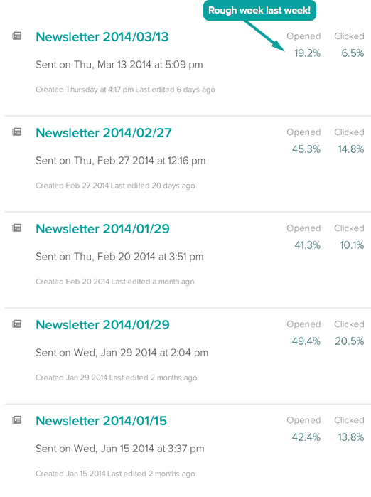
Customer.io Open Rates on this newsletter

Open rates and click rates are good numbers to start with, and a little critical thinking can help us determine why some emails perform better than others. I’ll explain how to do this with keywords in the next section.

A/B test everything

You’ve probably been told that before, but only in the context of your website. But it applies to your emails, too. Test subject lines, design, organization, structure, the placement of visual elements, buttons, and bolded headlines. Test everything, find what works best, and stick with it.

Look at what’s popular on your site

You can use Google analytics to find out what topics get your readers excited. If you want to go through the pain of tracking email segments in Google Analytics, go ahead. But there’s an easier way to find out what works.

Track what pages on your blog and website get the most views. Look for consistencies in the headlines, titles, and content of those pages. That’s what your readers are coming to your website for. That’s what they’re opening your emails for. And that’s what you should be delivering to them.

Most popular blog posts on customer.io last month

Takeaway: There are many ways to send successful email. What works best will depend on what your audience wants. Use Google analytics to find topics that get your readers excited, A/B test everything, and critically examine your open and click-through rates.

2. Use proven keywords around topics your readers care about

Keywords are words or phrases that you can use throughout your site to match up with corresponding user search terms and relevant content online. High quality, relevant, and popular keywords give you a higher ranking in Google search, making it more likely for people to find you.

For example, if you’re a SaaS with a focus on developer tools, you should have keywords and phrases like “software”, “agile coding tools”, or “programming” on your homepage, blog, and docs to improve your ranking in search results. You should also include specific keywords related to your topic; if your software is intended for Rubyists, you’d want to include keyword phrases like “Ruby developer”, “Ruby coding tools”, or “Ruby on Rails” You get the idea.

The same keywords that you’ve proven to work on your site should be present in your emails, because they grab readers’ attention. Popular keywords are popular because people keep searching for them. They’re interested in them, they want to know more about them. Tie those words into the emails you send when they relate to content that is interesting, useful, and compelling.

This is evident when we compare the last two emails we sent our subscribers. Our most recent newsletter focused on using color in your emails. It was an interesting piece, but the subject line was crap from a keyword stance: “Here’s why blue is so popular and Contrast drives action.”

Using color in your emails bad newsletter content example

The body of the email wasn’t much better. See any words in there that you could imagine searching for in Google? Even though the subject line was (I think) somewhat intriguing, there’s no keyword that stands out. The body of the email used an image and bolded lines to draw in attention, but with no keywords or key terms, it simply wasn’t compelling enough. Our open rate for that one was 19%, and our CTR a mere 6.4%. Not ideal.

The newsletter we sent out prior had a 45% open rate and a 15% CTR. Why the huge difference?

Data about best time to send emails when to send newsletter example

The subject line for this email was “Why are we sending this email on a Thursday?”. We combined with an email body that has some great keywords and phrases: “email”, “schedule”, “boost your open rates”, “the best day to send emails”, you get the picture.

How do you find the keywords to use? Lots of research. Type every relevant search term you can think of into Google, and see what phrases and words the top results are using. Tools like Moz can help you find out what people search for when they’re looking for your site, as well as words where you rank high in search results. Copyblogger has a really helpful post on some tools and strategies to not only find great keywords, but to narrow them down to a select few that work. Use these words in your emails and blog posts.

Takeaway: Keywords aren’t exclusively for web pages. Research what keywords are popular in your content and across the web. Incorporate those words into your emails to peak readers’ curiosity, drive open and click rates, and create consistency with your website.

3. Scannable emails help people easily find content they’re looking for

You may think people don’t have time to read your email, but you’re wrong. People just don’t make the time to read emails that don’t give them valuable information. By making it easy to scan your emails and your blog posts, you’ll immediately give readers value by saving them the trouble of searching through to find the point of what you’re saying.

They can choose to read your article, or just pick out the parts that are useful for them. For example, you may have scanned through this blog post to find this one section, or you may have glanced through the takeaway points before deciding to commit to reading. I didn’t force you to read every line to find useful information. I made it easy for you to find it.

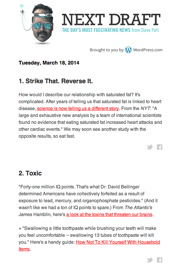
What does an easily scannable email look like? First, you have to have a great subject line that draws readers in and gives them a sense of your topic. It won’t matter how easily they can scan your email if they never bother to open it. But once they do, use visual cues, short paragraphs, and clean design to make it easy for them to scan your email. Here’s a great example:

Next Draft email scannable design readable example

Next Draft’s emails are fun to receive each day because they not only have really interesting information, they’re super easy to scan. From the headline you know that you’re reading “The Day’s Most Fascinating News.” You read on to see what it’s all about.

Bolded headlines are intriguing, short, and very easy to see. Red links stand out prominently from the rest of the text, which is also super readable in black and white. The sentences are short, crisp, and to the point. Social sharing buttons and lots of space between sections make it easy for you to run through, pick what you want, and get reading.

Takeaway: Using bolded lines, clear buttons, images, and short paragraphs are all great ways to make your emails more scannable. The easier your email is to read, the more likely people are to actually read it (and click through to your site because of it).

4. Telling a story makes it easier for people to get sucked in to your content

Writers are always trying to tell a good story, and your emails are a great place to do it. Think of the classic story structure: introduction, rising action, climax, falling action, and conclusion. Does your email follow this organization?

Another way to think about the story structure is with the acronym AIDA: attention, interest, desire, and action. Your introduction should attract the attention of your reader, raise their interest, and spark their desire for more. Your climax should encourage people to take action, to click or to sign up.

Thinking about your email in the structure of a story will help you figure out how its pieces fit together. Here’s a useful exercise: think of subject line as your introduction. You want to draw people in, build up to the climax, and be clear from the start. Make the climax the goal of your email, and have the conclusion reinforce that goal.

Where your climax lies depends on the kind of email you’re sending. Some newsletters share the entire full-length post in the body of the email. While there are plenty of benefits to this approach, it does have some drawbacks. Blog posts address those drawbacks, which is why (even with a few complaints) we realized we can create a better experience overall if we send an email update to you and direct you towards our blog to read the full content.

Pick what works for you. Patrick McKenzie sends very long educational emails on SaaS, A/B testing, marketing and lifecycle emails. He’s got plenty of great examples of success with his methods, and he knows how to tell a story that grabs your attention.

If you want to sell a product, maybe your climax is the final sentence in a story about how someone raised their conversion by 100% using your service. If your goal is getting people to click through to a new page, your click-through button is your climax. Make sure your email leads up to it, and make your story so interesting that people just have to find out what comes next.

Here’s an example email from our customer Shopify:

Shopify example email

Takeaway: Think about the structure of your email as if it were a story. Doing so will help you organize your message, find out what information is the most important and where you want it to be, and make your email flow. Make your climax the most important part of your email and make sure your content leads up to and falls down from it.

5. Get feedback from people and use that to improve

Feedback is one of the greatest tools you have at your disposal. If you’re trying to write emails people will read, ask them what they’re interested in reading! It really is that simple. Of course, you can use keywords and research to get a sense of where to begin or where to find ideas if you get writer’s block. But your emails are intended for your readers and should serve them as best as they can.

When Customer.io was looking to hire me, I did a guest a post but had no idea that Colin asked all of you for feedback! He shared that feedback with me. Here’s what one person said about my guest post:

My 100ms feedback on this one: I found it too light in content, too much like the “scientific” soundbites about “the latest study that shows that…” that litter modern media.

You can use feedback like that to improve what you do week after week.

Takeaway: Your audience knows better than anyone what they want to read on your blog. Ask them for their feedback on topics, content, and the structure of posts. They can teach you more about your content strategy than any book or article.

So now, I’d like to ask for your feedback. How am I doing, and what I can do better? Am I missing something? Is there some topic you’d like me to address more frequently? How is your experience getting our newsletter, and what can I do to make that experience even better?

Please tell me in the comments, or email me at nora@customer.io . I only have one request: please don’t hold anything back.

How to send SaaS onboarding emails without being a nag

$
0
0

Most people write their onboarding emails all wrong. The key to onboarding new people in your SaaS app isn’t to nag them in to submission. In this article, you’ll learn going how to write onboarding emails that provide value and that people will appreciate receiving. We’re going to show you how to not be a nag.

A few months ago, Colin addressed how you can use email to improve activation. In that article you learned not communicating with people isn’t helping them, and sending emails is an effective way to boost conversions or move people along who are stuck in your activation funnel. But be careful! Sending emails that nag is even worse for your relationship with customers than doing nothing at all.

Nagging emails irritate your customers. Don’t send them.

Imagine this scenario: you sign up to try a new app. You’re excited to get started, but things come up at work, and soon you get distracted. You get an email the next day saying, “You signed up, but you didn’t do anything. Start using us now!”. You want to, but you have too many other things to do.

Now imagine if you kept getting that same email saying “You didn’t do X, so do it.” Eventually you’d get annoyed, frustrated, even angry. That’s because emails like this are extremely nagging and unpleasant. Like your mother telling you to do your homework over and over again.

What classifies a nagging email?

  • It assumes the recipient already knows the product is worth their time
  • It assumes that since someone signed up for a trial, they’re immediately ready to buy
  • It repeats the same request, over and over.
  • It doesn’t focus on how the reader benefits, only the sender
  • It’s impersonal, cold, and solely concerned with making a sale

Some people might be ready to purchase immediately when they sign up for an account. But many more sign up to try out your product and take a look around before committing. Potential customers want to see how your product will help them solve their problems. Use onboarding emails to explain how you help people achieve their goals, before you try to convince people to buy.

When you’re sending emails to encourage people to use and eventually purchase, it’s worse to nag than to send nothing at all. Nagging emails are annoying, irritating, and not worth anyone’s time. Next I’m going to show you a way to send onboarding emails that don’t nag and will improve your conversions.

Takeaway: Don’t send nagging emails that accuse people of inactivity and tell people to take actions. It will only frustrate and irritate your potential customers. It’s better to send nothing.

Ditch the nagging emails for messages that deliver real value to potential customers

Here are four strategies to help you move away from nagging emails and send messages that actually have something worth saying.

1. Address common questions and objections at that stage in the funnel

With each email you send, put yourself in the recipient’s shoes. Where are they in your activation funnel when they receive your message? Why are they receiving it? How is it going to help them move forward with your product?

Not sure what the common questions are? Start by looking through support tickets for what people write in about.

There are multiple reasons someone may have stopped progressing through your funnel. It could be because of lack of motivation, trouble understanding the product, or a combination of both. Successful onboarding emails explain why they should move forward in the funnel, with a way to get more information about how.

A good example comes from Nimble, who emailed Colin after he signed up but hadn’t made any changes to his account.

Nimble convincing email example onboarding

This email addresses that he hasn’t added any team members to his account, clearly highlights the benefits of doing so, provides more information that might motivate him to add in members, and then gives him the tools to go in and do it.

Emails like this don’t have to be contained to cases of inactivity. Rewarding people for doing something is equally effective. Check out this message from Hackpad:

Hackpad email positive reinforcement onboarding example

A few days after signing up for their product, and only using their basic features, I received this email informing me of more advanced tools I could try. This positive reinforcement encourages me to continue using the app, and to try more advanced features within it. That encouragement might even lead me to make a purchasing decision.

To design a great onboarding experience, think about where people in the funnel might be coming up against roadblocks. Write articles that answer their questions and send them out before people even have to ask. Rather than pushing people to do something, give them the tools to do it themselves, and reasons why they should.

Takeaway: Help your prospective customers by anticipating their needs and addressing common questions at stages in your funnel.

Keep educating people about why your product is awesome

When picking new software, people often evaluate multiple tools at once. Educate people about why your product is great at solving their problems, and you’ll show them why they should commit to you over the competition. For example, check out this email from Generator, which highlights features that makes their product stand out:

Generator education highlights email onboarding example

This email clearly states what’s valuable about Generator, and what makes it a good product. In a few simple lines, it demonstrates the advantages of using this service. It also shows that Generator has subscribers’ interests at heart; they’re providing a service to make their product more enjoyable to use, for their customers’ sakes.

Takeaway: You should never stop educating people on how great your product is. Demonstrate your value to potential customers by highlighting the benefits of your product until they buy. Then, continue to educate them to show why purchasing was a good decision.

Focus on benefits (not features) of your product

Potential customers need to know what benefits your product will bring to them. Focus on what people will gain by highlighting how using particular features or taking the next step in your funnel will help them solve their problems. For example, check out this resource Gibbon sends out to their email subscribers:

Gibbon email reinforcement benefits onboarding example

This reminds recipients why they signed up in the first place. And if the next step in Gibbon’s funnel is to get people to start a course, then this email clearly demonstrates the benefit of moving forward.

Takeaway: Demonstrate how advancing to the next step of your activation funnel will help your customers access even more unique benefits from your product.

Give people a single, clear call to action

When sending an onboarding email, use a single call to action. When people are stuck at a step in your funnel, confusing them with too many choices makes it less likely they’ll pick one. This email from Runkeeper has one single, clear call to action:

Runkeeper single CTA call to action example email

If people want to advance, they’re drawn to that big blue button.

A single CTA can dramatically improve click-through rates. Even in a newsletter, HelpScout managed to boost its click-through rate by 17%, simply by eliminating multiple calls to action. Imagine what a 17% boost in your onboarding email click-throughs would mean.

Choice paralysis is kryptonite for purchasing decisions, as demonstrated in an experiment by Sheena Iyengar. She set up a table selling jams, varying the number of jams in each condition. With only six jams on the table, 40% of people who passed by stopped, compared to 60% who paused at a table with twenty-four jams. However, nearly 30% of the people in the six jam condition made a purchase. Only 3% did at the larger table. Too many choices made it harder for people to make a purchasing decision, leading to less sales overall.

Graph demonstration Sheena Iyengar choice paradox example data

Providing people with too many choices, especially when they’re already stuck in your activation funnel, will only make it harder for them to advance. Give people one way out, and they’re much more likely to follow your direction.

Takeaway: Giving one call to action will eliminate choice paralysis and actually encourage people to advance to the next stage of your activation funnel. Provide a single, clear call to action.

All of these strategies highlight one key point: the secret to not being a nag is by delivering value in every email. Even if the email you’re sending is triggered by someone’s inactivity, or because the person hasn’t done something yet, you want to deliver value and education to help them make informed decisions about advancing into the deeper stages of your service.

When you’re educating people, providing them with answers to their questions, and alerting them to the benefits of using your product, you’re not only helping them. You’re building trust and making your onboarding experience, and by extension your service, stand out from the rest of the crowd. If that doesn’t convince people that you’re worth sticking with, then what will?

Takeaway: The goal of your onboarding emails should be to deliver value to your customers. Do that, and you’ll easily avoid being a nag.

The frugal writer's guide to making content work twice as hard

$
0
0

Here’s a secret for you. You don’t just get one shot when you write an article. Your idea has the potential to extend far beyond that initial post.

When I first joined Customer.io, I struggled with how I’d come up with original content for every blog post, email education course, and presentation I envisioned for our marketing strategy. I was overwhelmed by the stress of generating all that material.

The fog cleared when Colin explained that it would be better to write one great piece of content, then adapt it to other places later. All I’d have to do is recycle my work.

That sounded much more manageable than writing everything from scratch.

It pays to be selective with your time, dedicating your resources to creating great ideas. Recycle those ideas, and you could double the life and influence of each piece of content you create.

Reusing content will save you time and resources while still raking in the marketing wins. Here are some strategies I’ve learned that will help start making your content work overtime.

When you write, try to get three uses out of each idea

When you’re brainstorming for an article, consider how your idea can extend beyond your blog. For each idea, we try to make sure it can at least be used in the following ways:

  • Once in a blog post
  • Once in an email course
  • Once in a presentation (or class)

Content_producttion_recycling_cycle

If you can do this for every idea or article you write down, your pool of available content will grow exponentially.

Repeat your ideas to establish expert knowledge of a topic

You might be a little skeptical about sharing the same content multiple times. But it’s unlikely you’ll have the same audience each time you share an idea. And even if someone has heard the idea already, they’re more likely to sit there nodding in agreement than get upset.

Great content producers repeat ideas all the time. Austin Kleon, author of Steal Like an Artist, says it best: “Nothing is original.”

Every idea is influenced by ideas before it. If you can recognize ideas worth repeating and express them articulately, people will like your content so much they won’t care if they’ve read something similar before.

When you have several resources covering the same topic, you establish yourself as an expert. Copyblogger has tons of resources covering all aspects of copywriting. Their vast wealth of available resources makes them seem more trustworthy than blogs with less to offer.

To establish a reputation, you have to prove you know what you’re talking about.

Repeat your ideas, many times and in many places, and people will be loyal to your expertise.

Recycle content to reach new audiences

Reusing content also extends the reach of your material. Make your information available in more than one space and it will be easier for people to find you.

For example, you might have a great piece of content in your documentation that could also be valuable as part of an email course. You could deliver the same advice to two different audiences by having the content available in both places.

Recycling content also boosts SEO. When you have multiple pieces of content on the same topic, you’ll generate more opportunities to target specific keywords.

If you have a higher keyword rank, your site is easier to find in organic search. A higher rank leads to more traffic, which leads to more readers and more potential customers.

Find a cycle for re-using your ideas

Our content cycle has gone something like this:

Research–> Blog post –> Email Education Course –> Presentation (or class)

For example, one of the earliest things Colin ever wrote about was the “The Lizard Brain and email”.

Customer.io_lizard_brain_image_email

After it was published, there weren’t a lot of new people discovering the post on their own. To extend the reach of the post, Colin re-used it almost verbatim in an email course on copywriting.

When Colin was asked to do a General Assembly class on copywriting, the same idea seemed important to share. But to hit the point home, Colin added a quote from Seth Godin:

Seth_Godin_Lizard_Brain_GA_Course_Slide

Later, he used some different slides from his class to supplement content we had on the blog. Everything came full circle, but we had four unique items of content to share with our readers, with only one idea.

Repurpose user questions into effective documentation

As our customer success engineer, Diana has to recognize when an individual’s question might be useful to our entire community. When she notices some topics are becoming common, she turns her answers into documents on our help page.

Anyone with the same question can find it on their own, and we’ve been able to scale without overwhelming Diana with common questions.

Most of tutorials that Colin filmed have also been turned into documentation on our help page. While the video content is great for first timers, it’s not the best resource for people who are just trying to look up a quick tip. Having both options available makes it easier for customers to find the information they need, in the format that works best for them.

Use email courses to bring new customers up to speed

The lessons in any course can be repurposed from a blog post, a webinar, or a presentation. As long as the material connects in a cohesive way and still delivers educational value, you should reuse content you’ve already spent hard work on.

A course can be a great way to get new users the information they need to make a commitment to your product. By sending them useful advice directly, you save them the trouble of searching through your archives for relevant posts. And making customer lives better only builds more loyalty.

Repetition helps people know what you stand for

Most great writers and speakers have just a few ideas they write and talk about. It’s the repetition that makes you associate Malcolm Gladwell with the ideas from his book “The Tipping Point,” or Simon Sinek with "Why your business exists”.

What about the ideas in your company? What are the core areas that you focus on and how can you use the content you’ve written in new ways to clarify your message?

If you aren’t recycling your content yet, here’s a little assignment. Pick five related articles from your blog and take twenty minutes to outline a hypothetical email course. I guarantee by the end, you’ll have the makings of a successful piece of content you can use for on-boarding, with only a little effort.

Please share your content re-use stories in the comments below.


Customer.io's Response to Heartbleed

$
0
0

Most of the internet was reacting this week to an exploit called Heartbleed.

On Tuesday, we had closed the primary vector of attack and tweeted about it.

We received a few questions since then and wanted to more broadly talk about how we’ve addressed the Heartbleed bug.

What we did to secure your data

  • We immediately upgraded OpenSSL on all servers in our control
  • We use Amazon’s Elastic Load Balancer (ELB) service. They fixed Heartbleed on their services.
  • There is no evidence anyone had compromised our certificates, but juust in case we have reissued SSL certificates from our certificate authority to ensure that all data in the future is properly secured.

What can you do to help?

The next thing you do should be to log out and log back in. We wanted to expire cookies, but learned that could have unintended consequences.

Thanks so much & best of luck patching all of your services too.

John Allison
CTO

What you need to know about Gmail's Grid View

$
0
0

Gmail Grid View

Google made headlines last week after announcing the new Grid view for their Promotions tab. While it’s still in field trials, Grid view will inevitably present a new challenge for your emails.

To prepare for Grid view going mainstream, and to make sure your emails look great for any customers trying it out, you should develop your strategy for Grid view ASAP.

Here’s what you need to know to make sure your emails continue to succeed in Grid view.

You can still view promotions in a traditional list

Even when Grid view is made available to the public, your customers will still have the option of toggling back and forth between it and the more traditional list view: Gmail Grid Field Trial GIF

This means you’ll have to optimize your emails for both experiences, since you won’t know how your customers are choosing to structure their inbox.

Subject lines and From names are shorter

In Grid, your subject lines will be limited to 75 characters max. Google also notes that sender names should be limited to 20 characters to avoid being “truncated.”

If you’re sending from a person in your company, their name might get cut off in Grid even if it looks fine in the traditional view. For example, my sending name, Nora from Customer.io, looks fine now…

Name in traditional inbox view

…but it’s cut off in Grid view:

Grid View From Name Cutoff

This is a little tricky. We’ve seen also longer From names displayed on larger screens: Non-truncated Gmail Grid From Name

but they get cut off on smaller screens. As a best practice, keep your sender name at or below 20 characters.

Since it’s your From name and not the address that’s cut off in this view, you will probably want to consider changing it. As long as the name is still recognizable as coming from your company, it should not affect your emails or cause your message to get routed to spam.

Preheader text is eliminated

Preheader text is the opening text of your emails that displays in the inbox after the subject line. Savvy emailers use this text to draw readers in.

Inbox Preheader Text example

In the sample above, Jeff Goins uses his header text to continue the message of his subject line, which flows seamlessly into the email. It’s a compelling tactic to get me to open his message and continue reading.

In Grid view, this text will be replaced by a feature image.

As you begin to think about what images might propel your readers into your messages, don’t forget about list view. Since Grid limits your subject lines to 75 characters, you’ll still need to include stellar header text for users who stick with the traditional inbox.

Grid view features infinite scrolling

Unlike the other tabs in Gmail, the Promotions tab in Grid view will feature infinite scrolling.

Infinite scrolling means you really need to stand out from the crowd, since it’s become much easier for people to just scroll past you. It might also impact the timing of your emails.

Being at the top of the Promotions list when your customer is checking their email is the best way to put your message front and center. Tell your subscribers what time to look for your emails; if you’re providing value, they’ll make sure to check their emails around that time to get your content.

However, if you do miss the top of the list cutoff, all is not lost. Since scrolling is easier, and people don’t have to open new pages to see older content, your message still has a shot even if it’s later in the queue. Despite being further down, endless scrolling might make it easier for people to find you. But your images will need to stand out to capture attention.

Your images will directly impact the “open or delete” decision

Gmail introduced Grid view to help people use images to “quickly pick out the deals and offers that interest them most.”

In the new grid view, there are four components you’ll have to account for:

Gmail Grid View Featured Images

Your sender name and subject line are carried over from traditional mail.

The sender image is pulled directly from your Google + profile or company page. If you don’t have one, go and set one up with your logo as the profile image. When you code your emails for Grid view, Google will use your logo as your sender image.

You can, and should, carefully select the image to display as your featured image each time you send a new email.

People are going to judge your messages almost exclusively on their appearance. Subject lines and from addresses are still important, but the image has become king.

Broken images, images that aren’t properly aligned or formatted, or no images at all will make your emails are much more likely to get automatically deleted. If you don’t include any images, Gmail will grab text from your email and display it in a blank space:

Blank Text in Gmail Grid View

Simply having images in your emails isn’t enough either. Your emails will need to be formatted properly with HTML code to tell Google how to render your feature image. If you don’t specify your feature image with code, Google will put your email through an algorithmic washing machine. They might show one of the images in your email, but crop it incorrectly, like this:

Broken Image Gmail Grid View example

Even if you have images in your email, Google’s algorithm might also select a random piece of text from anywhere in the email message and use that as your “feature image.” But don’t worry, this kind of mess is easy to avoid.

How to optimize for Grid view with Customer.io

You’ll have to implement specific markup, called a schema, into the HTML of each email. This can be included at the header of your emails and changed for each subsequent message you send.

Litmus has a great tool for building the HTML snippet you’ll need with your own information. You pass in your company name, company site, company Google + page, and your feature image.

Copy the HTML that Litmus generates into your emails using Customer.io’s HTML (source) view. If you go back to the WISYWIG editor to make more changes, send another test email to confirm nothing’s been changed.

You could also visit Gmail’s developer tools for Grid view. Just make sure to switch the code view from JSON to Microdata. Customer.io’s editor won’t support the JSON code.

Copy the microdata code into the header of your emails (using HTML view) and fill in your identifying information. This method takes more legwork, so I’d recommend Litmus’ tool if you’re looking for an easier solution.

The recommended image size is 580 X 400 pixels. If you don’t have the resources to create a new image from scratch each time, you could also crop and resize an image from your email to feature in the Grid.

Your feature image does NOT need to be included in the actual email you send. You could design an image optimized for the Promotions tab that really stands out, and still maintain the relevancy of the images in your email.

Go big and go bold with your Promotions images, like Airbnb, Gilt, and Uber:

Good Grid Email Images Example

You’ll need make a splash, and everyone is competing with you for people’s attention.

If you haven’t signed up already for the trial, go to Google and enter in an address you’ll use for testing. You’ll be alerted if you’re chosen for the trial. The best way to test how your emails look in Grid view will be to send to this address, or the address of someone you know with Grid view enabled.

Grid view will support feature images as GIFs, PNGs, and JPEGS (though animated GIFs will be rendered into a static image by Grid view). It will also change the way your emails look depending on their status. An unread email looks like this: Unread email Gmail Grid View

While a read email looks like this:

Read Email Gmail Grid View

You could also test if your emails actually end up in the Promotions tab. But even if testing shows your emails aren’t landing in Promotions, optimize your messages for Grid view. You never know if someone will switch your messages over, and you don’t want them to have a bad experience as a result.

Don’t forget to test your images, your subject lines, and your sender names to find what works best with this new challenge.

The future of your emails in Grid view

It’s too soon for anyone to have concrete data on the impact of Grid view on your emails’ success. But to stay ahead of the game, you should code for a new image each time you send out an email.

One of the really nice changes of Grid view is you can let your personality shine into the inbox. While it might mean a little more work now, designing a new, relevant image for each email will keep your readers even more engaged. Ultimately, Grid view is another interesting way for you to deliver value to your customers.

So tell me, have you made any changes to your emails because of Grid view? What are some of the challenges you’re facing, and how are you trying to overcome them? Please let me know in the comments below.

Snag the marketing secrets behind the Cronut to build an audience that sticks

$
0
0

Dominique Ansel might not be a name you’re familiar with, but here in New York he’s kind of a big deal.

He’s the creator of the Cronut, a doughnut-croissant hybrid filled with pastry cream, in unique flavors liks fig mascarpone and passion fruit caramel. It’s crunchy on the outside, creamy soft and delicious on the inside.

And I waited over an hour to get one.

At 7:20 on a chilly Monday morning, I rounded the corner to Dominique Ansel’s SoHo bakery to find myself at the end of a line wrapping around the block.

The crazy line for the Cronut

I wait on this line for most of the morning to purchase two of these pastries.

Passion Fruit Caramelia Cronut

They’re tasty. Really tasty, actually. But worth waiting in line for over an hour? Maybe not.

Yet, in the past year since their conception, people have been lining up just to get a taste of the Cronut.

So why is Dominique Ansel so successful?

Some might say it’s because the Cronut is so darn good. That’s definitely part of it, but Dominique Ansel is more than just a great baker.

He’s an incredibly smart marketer who understands how to make his loyal audience hang eagerly on everything he does.

Ansel’s strategies keep the lines long and his bakery in business. But he doesn’t have a special secret. Most of what Ansel does can be easily applied to your own business.

You just need to be a little creative, a little hungry, and maybe a little sugar-crazed. Here are three marketing strategies to borrow from the baker who took New York by storm.

Use scarcity to drive demand

The Cronut is more than just a great pastry. It’s a limited-edition item. There’s only one flavor each month. Ansel and his team make 200 a day. You’re allowed two per person. That’s it.

Oh, and even the word “Cronut” is trademarked.

That means there’s only one true Cronut, and one place to get them. Imitators can’t call their interpretations Cronuts (though Croissant Doughnut, Dough’ssant, and Crobar are all okay). You can only get the real thing from Ansel, and he’ll only let you take two.

The scarcity of the Cronut has contributed largely to its demand. It’s lead to a thriving “black market” of hawkers selling scalped pastries on the street for up to 400 times the original price, lines around the block, and a growing number of bakeries trying to create their own versions to compete.

The idea that scarcity drives demand is not new. The less of something there is, the more value we place on it, the more we want it, and the greater the lengths we’re willing to go to get it.

That’s why you can sell your sold-out Beyonce tickets for hundreds more than they’d otherwise cost.

Scarcity enhances the perceived value of objects , services, and opportunities. Advertising a product’s scarcity, or restricting maximum order sizes like Ansel makes us perceive it as extremely valuable.

Studies have also shown that owning commodities perceived as special or valuable boosts your feelings of uniqueness within your society.

Since Western societies use commodities as status symbols more than other cultures, owning a particularly special commodity raises our status amongst our peers. So we’re super attracted to items we perceive as unique and difficult to acquire.

For Ansel, the scarcity of the Cronut isn’t necessarily intentional. It’s mostly due to the limitations of his staff and his kitchen. He can’t make more than he does each day (he still has a full bakery to run) without sacrificing quality for quantity.

Many small businesses experience these same growing “pains.” When Mailbox, a mail app for iPhone recently acquired by Dropbox, was first released to the public, you could download the app immediately. But to actually use it, you’d have to wait.

The delayed acceptance was due to Mailbox’s initial ability to scale. To work properly, it relied on servers and storage in the cloud. A sudden influx of users would crash the application, ruining the experience for everyone.

So Mailbox chose to slowly trickle in customers. But they managed to make the experience even more enticing than a coveted membership.

With 800,000 people in line, they could have lost many potential customers just because the wait was so long.

So they employed another tactic, known as hedonic adaptation, to keep people on line excited and engaged. Hedonic adaptation is the theory that limiting exposure to good things at first makes your experience of those things more pleasurable later.

Like delayed gratification, the anticipated pleasure keeps you engaged and working towards your goal: in this case, getting into Mailbox. When you finally do get in, it feels better than it would have if you’d gotten it immediately, because you’ve worked and waited for it.

(This, by the way, is how it feels to finally get your Cronut after waiting on line for an hour.)

Ansel makes use of hedonic adaptation by announcing the Cronut’s single flavor on his site each month (along with its predecessors).

Cronut Announcement

Those who can’t get a Cronut immediately, either because of their location or ability to wake up at 6:30 AM, get little hints and teases about what the Cronut will be like. When they finally do get it, they’ve been waiting for a long time to get the particular flavor they’ve dreamed of.

Mailbox also kept their signups in a constant state of limbo, but the limbo kept shifting. When people on the waiting list sign into the application, they can see exactly how many people are in line before them, and how many people are behind.

Mailbox App wait time

Source: Cult of Mac

As the numbers slowly change, people feel like they’re making progress towards their chance to use the app. They continue to anticipate what it will be like to use Mailbox as the line ahead of them gets shorter, and they feel proud of their position as the line behind them gets longer.

Using the existing scarcity of your product, either due to constraints on your system if you let too many in or simply to control for quality, will make the demand for your product rise.

And if you control that demand by letting people in as a slow trickle, rather than a flood, you’ll start to build a cult following that eagerly awaits your next move.

Uniqueness and familiarity keep people hooked

The Cronut is more than just scarce. It’s unique. If you haven’t tasted it, there’s no way you can know what it actually tastes like.

But here’s the catch that makes the Cronut so enticing. You can’t know, but you can still imagine how it tastes.

Everyone knows what a croissant or a doughnut is. You know what it’s like to eat one. But you probably haven’t tasted a combination of the two.

The Cronut is uniquely familiar: it’s unusual and totally original, but you can still imagine what it might be like. It’s crunchier than a croissant but still flaky. The inside is creamy like a doughnut, but the filling is distributed evenly throughout the layers of dough, so every bite get a little bit of everything. It’s not something someone dreamed up from thin air; it’s a combination of experiences you’ve had before, turned into something completely new.

You are naturally drawn to things that are familiar to you. In fact, you prefer them. This is called the mere-exposure effect, and it’s been demonstrated to affect everything from words, sounds, and pictures to people, and yes, food.

But uniqueness is just as enticing. The Von Restorff effect, identified by a scientist of the same name, is often called the isolation effect. It describes how you’re more likely to remember unique items from the rest of a group. Those items that “stick out” are more likely to stay in your mind when you’re asked to recall them later.

Put these two effects together and you’ve got a powerful psychological phenomenon. You prefer things that are familiar, but things that are unique make more of a lasting impression on you.

The Cronut (and successful businesses) will make you experience both of these effects.

The mix of familiarity of the Cronut means that even though you can imagine it, even though you can almost taste it (and that makes you really like the idea of it), you can never know how Cronut tastes until you try one.

That uniqueness makes it hard to shake the idea of a Cronut, the constant nagging question of what is it like?

All the impostors out there enhance this feeling. Even if you tried a knockoff, you’d always wonder whether it was just as good as the original. You’d ultimately still bring Ansel your business.

Having a product that’s unique and familiar, that also has limited access, makes people go to great lengths to find a way around your restrictions.

Svbtle, a unique blogging platform, gave out extremely limited access when it first started. As a blogging platform, people could imagine what it might be like, but they couldn’t experience the real unique aspects of Svbtle without getting into the service.

But people were hungry to try it out for themselves. So they designed imitations and made them easily accessible. For example, someone made a Svbtle theme for Wordpress.

Wordpress Svbtle Theme

Svbtle isn’t trademarked in the way that the Cronut is, but you’re still not going to get the true Svbtle experience if you download any of the impostors. People wanted to experience Svbtle so badly that they were willing to create versions that weren’t as good just to get a feel for it.

It’s this same longing that drives people to download OS X themes for their PCs,

OSX Mavericks for Windows

or why pulling Flappy Bird from the app store led to the rise of the Flappy Bird clone.

Even though people can’t get the real thing for themselves, the thing they want is simultaneously so unique and so familiar that people drive themselves crazy trying to find a way to get it, even if it’s just an imitation.

Social proof demonstrates your product’s value to the masses

What causes the hype that gets people so excited they need to create their own imitations just to try and experience a product for themselves?

What makes people so curious that they have to go and wait in line to try the Cronut? How do they even find out about this mystery pastry?

Because no one will shut up about it.

The Cronut is good. But it’s not knock-your-socks-off good. However, you wouldn’t know it because there are hundreds of reviews written about it, claiming its value in magazines, publications, online, and in print.

Cronut publications

Everyone’s talking about it, so it’s got to be worth the hype, right?

And once people started talking about the Cronut, it began to snowball. More people talked. And more. Soon the entire city was talking. Then the country.

The more people that hear the hype, the more they talk about it. And the more voices talking about it, the more authority it gains as something valuable. It snowballs into viral status, like a kitten video on YouTube.

Word of mouth has astonishing power to increase perceived value of objects and experiences. And it happens all the time. In fact, I watched social proof unfolded into chaos and obsession at two New York outposts this week alone.

The first was a cat cafe, where you could literally go to get coffee with cats (who will undoubtedly sit on whatever you’re trying to read). People waited outside for six hours. Six. Hours. To play with cats. Because people wouldn’t stop talking about how amazing it would be.

And a new bagel shop, called Black Seed Bagels, went “viral” after becoming the food press’ new darling and finding themselves in several reviews. The demand got so overwhelming (with lines for blocks) that they had to close the bakery for a day to give everyone a chance to breathe.

Everyone is talking about these places, making them seem even more desirable than they would already be without the extra attention.

Social proof is something we experience intuitively. If we see other people doing something, we’re more likely to think its worth doing. This influence is even stronger when those people are similar to us.

In a 1982 experiment, a group of researchers solicited door-to-door donations for a charity campaign. When they displayed a list of neighborhood residents who had already donated, people were much more likely to do the same than if they saw no list. And the longer the donor list was, the more likely the people were to donate. This effect was even stronger when they saw their friends and neighbors’ names were on the list.

And while we’re on the topic of food, remember the cupcake craze a few years ago? It started when Sex and the City’s Carrie ate a cupcake from Magnolia Bakery on the show. After the episode, Magnolia’s popularity skyrocketed, and cupcake shops started popping up everywhere.

As the study above hints, the power of social proof only grows when the people influencing you are similar to you.

This is why many companies try to get a varied mix of examples for social proof, either as testimonials or as customers they display on their home-page. When prospective customers see a testimonial by someone similar to them, they place even more value on your product.

Display social proof throughout your website or product to show people why you’re worth the commitment. For example, Draft features some Twitter testimonials when you first log in, when you have your first opportunity to interact with the product.

Draft Social Proof

And Basecamp features social proof prominently on their homepage.

Basecamp Social Proof

We used to feature some of our most powerful social proof, our customers, at the bottom of our homepage, and we were missing out on a golden opportunity.

People need to see social proof in order for it to work. So we moved our social proof to a more visible position on our homepage.

Customer.io social proof test

When we did, we saw a 24% increase in people signing up.

Just like the Cronut, hearing other people give their seal of approval increase value perceived by new potential customers. Simply knowing that other companies like them were using our product successfully gave people the incentive to try Customer.io for themselves.

Using social proof throughout your home page, application, and website will remind people of the value you have to offer.

Customers that feel accomplished will stick with you

What do scarcity, unique familiarity, and social proof all have in common? They make people feel accomplished and proud when they finally get their hands on your product.

Scarcity makes people feel like the commodity they now have is unique, and that it makes them special.

Uniqueness and familiarity makes the product enticing, preferable to completely unfamiliar options, but still mysterious. And social proof demonstrates that other people value your product. All this makes you feel really good after a purchase.

I can relate. After finally getting the Cronuts, I shared a picture of them online, and got more Facebook and Instagram likes than I’d ever had for a food picture before. People wanted to know what it was like, if the wait was worth it, if they could have a bite.

It felt great. It made me feel like I was special, like I had accomplished something by overcoming the obstacles to get a Cronut.

But a word of caution: don’t create false scarcity or social proof around a product that doesn’t deliver.

You’ve all experienced what it’s like to wait in line for something that isn’t as good as you’d hoped. You’d never want to make your customers feel like a fool because you gave them inappropriately high expectations, would you?

You shouldn’t put false obstacles in the way of your customers’ success, but your customers should feel accomplished after deciding to use your product.

When someone decides to join your service or purchase your product, they should feel special. Make your customers feel like they’re joining an exclusive, unique, and valuable group just for them.

Offering something enticing, mysterious, limited, and proven valuable by others like them will make your customers jump at the chance to use your product. All you’ve got to do now is put these strategies in place, and soon you’ll have interested people lining up to try you out.

Do you use these tactics in your marketing strategy? How? Please share your stories in the comments below; I’d love to hear how you apply these strategies to your business.

P.S. If you’ve ever had a Cronut, what did you think?

How to use A/B tests to improve your email campaigns every week

$
0
0

Improve your email campaigns with A/B test image

“Hey.”

That’s the subject line that helped Obama raise 690 million dollars.

But how could Obama’s team know it would work?

It wasn’t because they had “one weird trick”. They were using a tried and true method:

A/B testing.

By testing the subject lines, layout, and content of their email marketing campaigns, Obama’s team was able to dramatically increase results from their fundraising efforts.

Big companies have people dedicated to just running A/B tests because this stuff works. That doesn’t mean that smaller companies can’t do A/B tests.

In fact, I might go so far as to say:

You need to be A/B testing.

What is A/B Testing?

For the folks who may not know, and as a refresher for those who do, A/B testing (also called split testing) is a method that helps you test a hypothesis about human behavior.

In an A/B test, people are split at random into two groups. For simplicity’s sake, let’s say they’re split 50/50 into each group (though it can be 45/55, 30/70, etc.).

Without being told, the users in both groups are presented with a stimulus: the original condition, known as the control, or a variation (what you’re testing). Then you compare the performance of the variation against the performance of the control.

A/B Test Image

If the new variation is more successful—because it drives more clicks, conversions, engagement, etc.—you can replace the old control with the variation and use it as the new control for future tests. If the variation does not outperform the control, stick with what you have and try a new test to improve on your results from the control.

An A/B test has two main benefits:

  1. It gives you data to back up what you think might be successful.
  2. It’s probably the cheapest way you can improve your sales or conversions.

A/B testing can be used on almost anything you can think of: your design, email copy (in the body or subject), calls to action, etc.

A/B testing helps avoid the correlation = causation trap

You might have heard the phrase “correlation does not equal causation”. Let’s define both of these:

  • Correlation is when two data sets are strongly linked together (i.e. as one increases, the values of the other increase with the same proportions).
  • Causation is when one data set causes a reaction in the other.

“Correlation does not equal causation” is the principle that while two data sets might appear to be linked, a change in one doesn’t necessarily cause changes in the other.

Here is my favorite absurd example:

Spurious correlations graph analytics Source: Spurious Correlations

While mozzarella and engineering degrees correlate, there’s no real way to prove that cheese consumption actually leads to more engineering degrees.

If you made that argument based on this graph you’d probably convince a handful of people, but reasonable people would likely see that there’s no proof one causes the other.

One common mistake people make while testing is assuming their change has an impact without data from A/B tests to back it up.

Here’s what happens when you don’t use A/B tests.

You make a change that you think will have an impact. If your conversion rate goes up, you assume that your change is the catalyst. But you have no way to prove it.

If you set up a test beforehand, you can measure the effect of your change against your control. That way, if the change outperforms your control, you have visible proof of what works and what doesn’t.

How to make sure your tests help you reach your goals

Now that you know what an A/B test can do for you, it’s time to set one up.

As simple as A/B tests are, a lot goes into making them successful. You can run A/B tests all day, but if you don’t run them properly, you’ll get nowhere in terms of your long-term goals.

Here are a few best practices to make sure you’re not wasting your time and efforts with your A/B tests.

Spend some time figuring out what your test’s goal will be. Going blindly into testing will only waste your time.

Do some research to see what other companies have done (and whether it’s improved their emails) and then evaluate if that change is right for you.

For example, even if changing the color of your call to action leads to a 1.4% increase in conversions, unless you’re the size of Google or Amazon this might just mean a few hundred dollars in sales. Certainly nothing to sneeze at, but it’s worth evaluating whether your time spent on smaller changes (vs creating a new variation from scratch) is worth the outcome.

Only change one thing at a time. For example, don’t test two different subject lines and two different layouts at once. This screws up your control condition because you’ll have nothing to compare your changes to. You won’t know if your subject lines caused the effect, or the copy. Pick one thing to test against a control; you can always run another test after you get the results from the first one.

However, those small changes will only take you so far. Eventually you’ll reach a “local maxima” and get to the point where in order to make a dent in your numbers, you’ll need to start from scratch.

A successful A/B test MUST be statistically significant

Reaching statistical significance means that the results of your test aren’t just due to random chance, they’re actually due to the changes you’ve made.

It’s shockingly easy to get results that are due to random chance. A great way to see this in action is running an A/A test using just your control. An A/A test works exactly the same way as an A/B test, but gives the same experience to both groups. It serves as a test to see how much noise exists from underlying natural variations. The amount of noise from natural variation will affect how you determine what statistical significance will mean for your test.

To make sure you’re reaching statistical significance, you have to calculate your correct sample size beforehand and run your test until that sample is reached.

If you end a test prematurely, you run the risk of concluding that an effect or relationship exists where it actually doesn’t. These false positives are a common mistake, and if you’re not careful, you might choose a winner that actually has worse performance over the long term.

In Customer.io, we represent statistical significance as ‘Chance to Beat Original'. We assess whether the difference observed between the control and the variation is greater than a difference due to random chance.

If the ‘Chance to Beat Original' (CTBO) is at 50%, that means that the variation will outperform the control 50% of the time. Since this is the same as random chance, a CTBO of 50% means there is no difference between the control and variation. The closer you are to 50% (i.e. 40% or 60%) the less significant the difference.

The further your CTBO is from 50%, the more likely there is a significant difference between the control and variation. To determine whether the control is beating the variation, or vice versa, Customer.io uses a significance level of 95%. So:

  • if the CTBO > 95%, your variation is outperforming your control

  • if the CTBO < 5% the control is outperforming the variation.

CTBO A/B test ranges email campaign

If your CTBO is between 5% and 95% it doesn’t meet our threshold for statistical significance.

We have such a high standard because no matter how many A/B tests you run, if you don’t have true statistical significance you’re wasting your time and effort.

When done correctly, A/B tests are a great way to improve the performance of your emails. A/B tests make it possible to move towards your long-term goals, ensuring each change along the way has a positive impact on your success.

And if you’ve had any successful A/B tests or results you’d like to share, let people know in the comments below.

Happy Testing!

P.S. If you want to set up and run A/B tests on your behavioral emails in Customer.io, we have a complete walk-through in our documentation. You can also learn how we calculate our CTBO (and how to calculate your own) by visiting our “Understanding Your A/B Test Results” page.

Personalized emails will make your customers even happier

$
0
0

Customer.io email campaign customer personalization

Have you ever walked into your favorite store or restaurant and a member of the staff immediately recognized you? Imagine they said something like “Hey Sofia, we just got in a great hat that will go with the coat you bought last month!”

It would be a pretty surprising feeling, right?

We’re used to wandering anonymously through the world. However, if we’re offered useful information based on our likes… well that would be pretty handy.

It’s possible to provide this kind of personalized experience with email marketing. You’ll need to plan ahead and collect some information first, but then away you go.

If the idea of including a personal touch in your emails isn’t enough to make you want to start, take a look at a recent study from Experian. They found that personalized emails had 29 percent higher open rates and 41 percent higher click rates than emails without any personalization.

Sending a highly targeted, well-personalized email can increase your opens and clicks, drive conversion rates higher, and deliver some serious value to your users.

What’s not to like?

How to use data to personalize your emails

Okay, so you’re sold. You want to start modifying your email content based on your user’s wants and needs. How do you get started?

Collect Data

The first thing you want to do is make sure you’re collecting user attributes and/or user actions. This could mean something as simple as adding a “Name” field when people sign up (or in a profile screen). Here are some other things you could ask for:

  • Name (first and last)
  • Location
  • Birthday
  • Favorite Color (or animal, or any favorite)
  • Interests (products, areas you email about, etc)

Alternatively, you can go a little deeper and store any applicable data you’re collecting. This could be something like what your user last purchased or what they’ve searched for.

If you want to know how to collect that data in Customer.io check out our integration information.

Use personalized information to benefit users

Before you go hog wild with personalization, you’ll want to consider what details you’re going to include in your emails. There is a fine line between helpful and creepy when it comes to personalized emails, and you don’t want to step over that line.

Adding a user’s name is generally a safe first step (more on that later). However, customizing everything based on what a user just searched for could quickly set you on the path to becoming Big Brother.

Take Amazon for example. Amazon is well known for their awesomeemailpersonalization but even they have crossed the creepy line and regretted it. If a giant like Amazon can take personalization a step too far, it’s a good warning to think carefully about your user’s privacy.

What benefit does your personalization offer users? If you’re throwing in personalization just because you can, that’s not good enough. Give your users something valuable based on their past purchases or preferences.

Think about your specific content as it relates to your product. If you sell something users could be sensitive about, adding information about past purchases or searches could be inappropriate or off-putting. If you’re selling T-shirts, you’re probably safe.

Think about our fictional Sofia above. The store staff remembered her name and her last purchase, and then they used that to point her to coordinating products. The “wow” moment wasn’t so much because of the personalization, it was how useful the suggestion was.

Ultimately, how you personalize your emails will depend on what information you collect and how you can use it to benefit your users.

Check your data to use a name correctly and powerfully

The first step most companies take is including a user’s name in their email, but even then you want to be careful. The research on using names in emails is a bit mixed: Experian’s research showed a 26% boost in open rates when the subject line was personalized with the user’s first name, but research done by Temple University shows the opposite, with users being less likely to respond when their name is used.

Why the conflict? A name done right is powerful, but so often they go wrong (old names, incomplete names, misspelled names, etc).

When you’re personalizing with names, you want to be very careful about the data you’re collecting. You might want to manually skim through your recent user additions to make sure nothing looks off. If someone added NO!zzzzhha as their name, you might want to just delete it rather than risk sending an email with “Hi NO!zzzzhha!” Spending a little bit of time to make sure your data is clean can pay off big in the long run.

In addition, we recommend adding logic whenever you can, to make sure details make sense and look truly personal–not automated. One tip, if you have a mix of capitalized names and ones that aren’t is to force capitalization.

For example, in Customer.io you can automatically capitalize names by adding a “| capitalize” filter to your Liquid ({{ customer.first_name}} would become {{ customer.first_name | capitalize }}). Sending an email that starts with “Hi Ruxin,” looks much more professional than “Hi ruxin,”.

If you’re not using Customer.io to send your emails, check with your email provider and see if they have any tricks for standardizing your data before you add personalization.

If you’re in doubt about the validity of any of your data, just skip it. It’s better to be impersonal than blatantly incorrect.

Personalize with related content to engage users

Once you’ve dipped a toe in the personalization waters, there are many ways to get more advanced. Consider including information about what a user recently searched for or updates to items on their wish list.

What if you had just sold someone a killer new T-shirt? Consider sending them an email pointing out accessories or other clothing items that would coordinate with their new tee.

Personalizing with related items can have a big payoff. A study from Temple University found that when customers are directed to products that their past purchases suggest they’d like, it triggered positive feelings in 98 percent of customers. Positive feelings equal more sales. Who doesn’t like that?

Not ready to take that large of a leap? How about starting with something smaller? Let’s say you’re handling communications for a children’s sports league. Every email you send is letting the children and their parents know when games are scheduled or specific steps that the parents need to take before their child can play.

Generic Sports League

While you can send everyone the same generic email above, what if instead you only showed information relevant to them? You could tell them when their games are scheduled or let them know about registration steps they still need to complete.

Personalized Sports League

Personalized design adds a fun, unique touch to your emails

Don’t just think about personalization when it comes to your content, consider personalizing your design as well. Remember the suggestion of asking a “favorite color” above? You could have some fun with that and incorporate a user’s favorite color in the emails you send them. Changing your email’s color based on a user’s like might tip away from being a direct benefit for the user, but it’s still a fun touch.

Or take our sports league example from above. The standard blue header could be changed to be the team’s colors, all with a little bit of personalization in your email.

The Bears!

If you’re using Customer.io, you can add some if/else tags to your layout. For example:

{% if customer.team == 'Bears' %}
<img src="http://www.mydomain.com/teams/bearsheader.png">
{% elsif customer.team == 'Giraffes' %}
<img src="http://www.mydomain.com/teams/giraffeheader.png">
{% else %}
<img src="http://www.mydomain.com/teams/default_header.png">
{% endif %}

Don’t forget to test along the way

Not to put a damper on the personalization party, but before leaping into the deep end, we recommend taking small steps and testing as you go. Adding varying types of personalization is a great thing to A/B test.

Choose something simple and see how your users respond. Maybe your users will fall into the group who happily opens emails when their name is included rather than the group who finds it off-putting. You won’t know until you try it out.

Personalization sparks positive feelings in your users. Positive feelings make them more likely to stick around and think about your company favorably. Personalization can also drive more purchases and conversions, because you’re using it to send relevant content to the right person at the right time. It’s a bit of work to get started, but the payoff is worth it!

Try it out, see how your users respond.

Are you doing anything great with personalization that you want to brag about? Hung up on the right tactic to use or how to collect user data? Have you seen any really awesome T-shirt designs recently? We’d love to hear about it in the comments below.

Happy Emailing!

P.S. Want to start personalizing your Customer.io emails? We have a help doc explaining how to personalize your emails with Liquid.

Viewing all 214 articles
Browse latest View live